👈🏻 back to all

Client:

Nel Hydrogen

More information

Title:

Brighter colour, more depth

Journey:
Brand Evolution
Service:
Motion design, Visual Identity
Industry:
Energy & industry
Location:
Norway

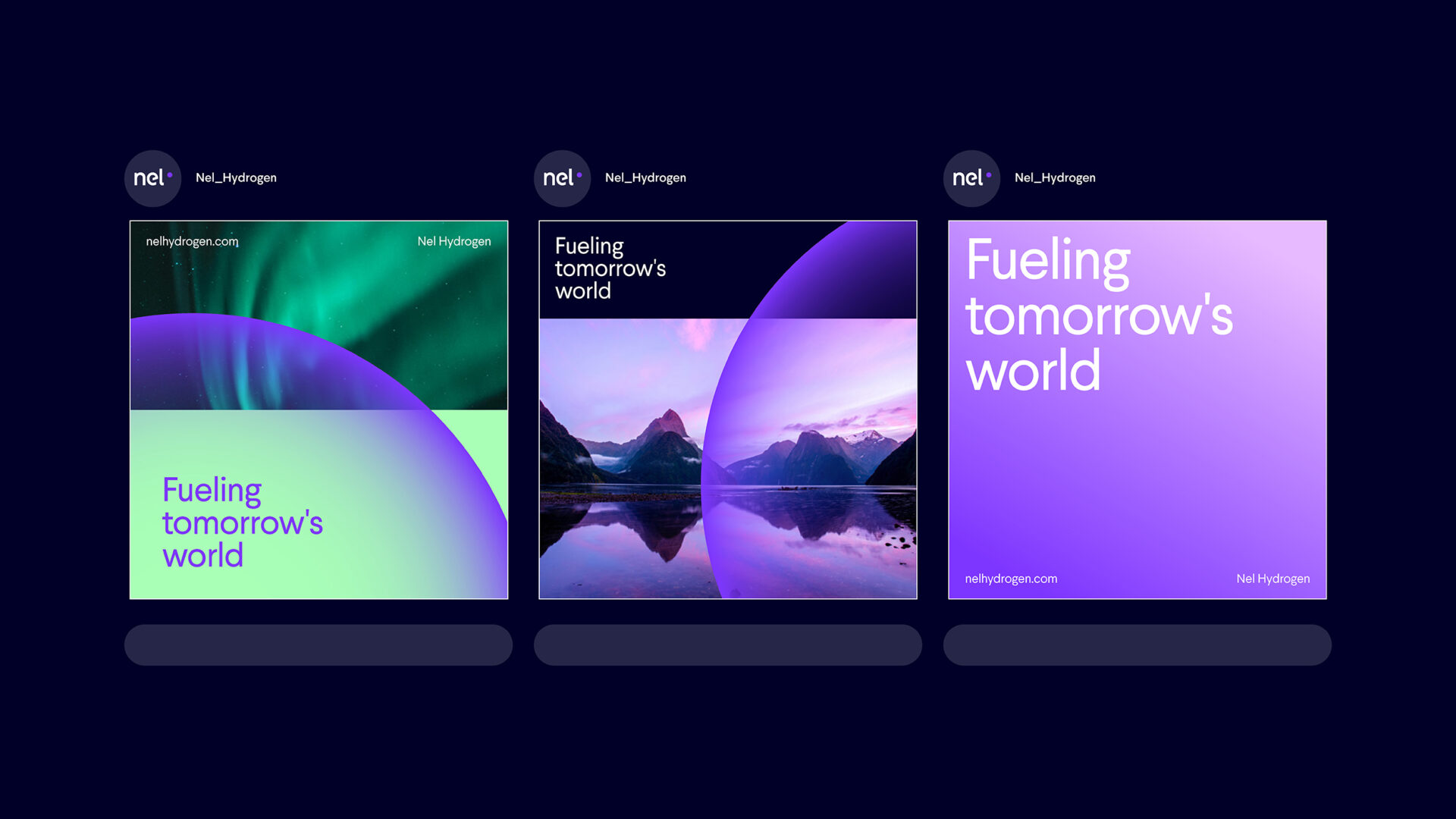
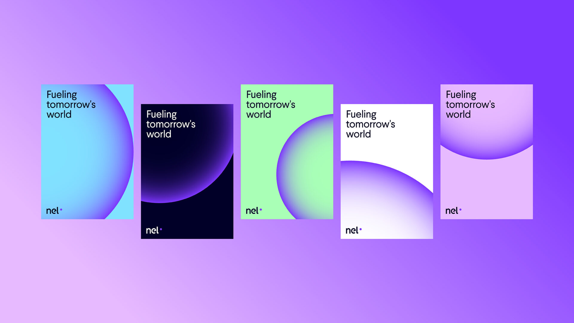
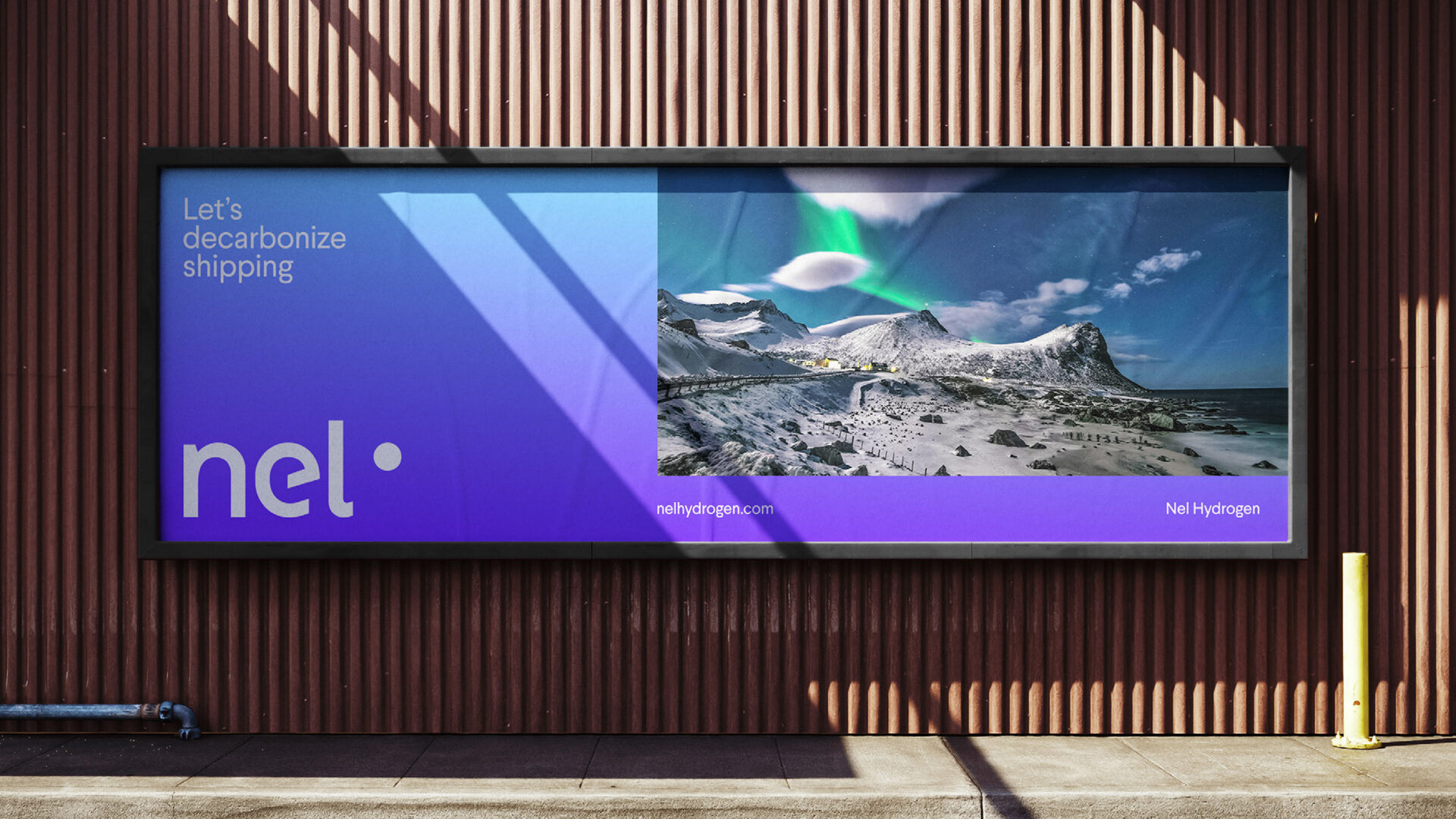
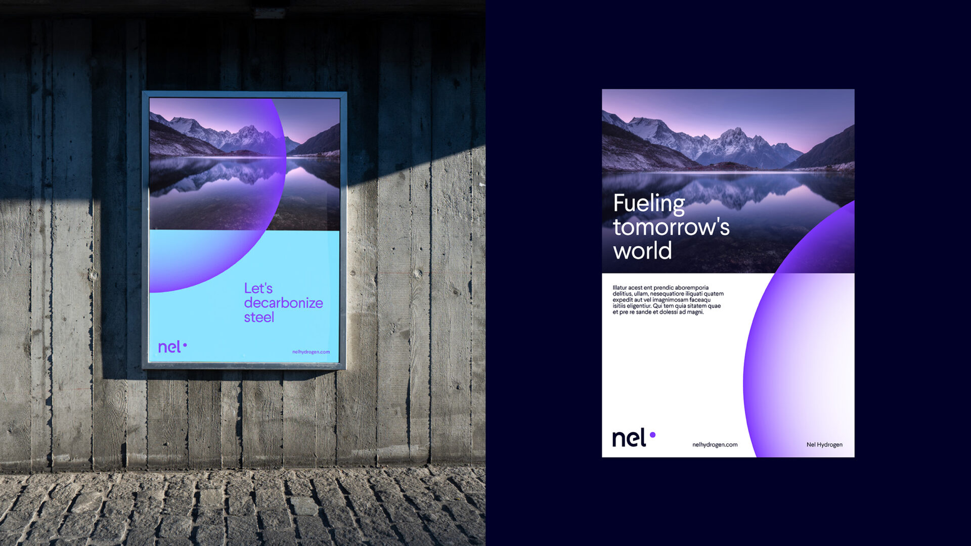
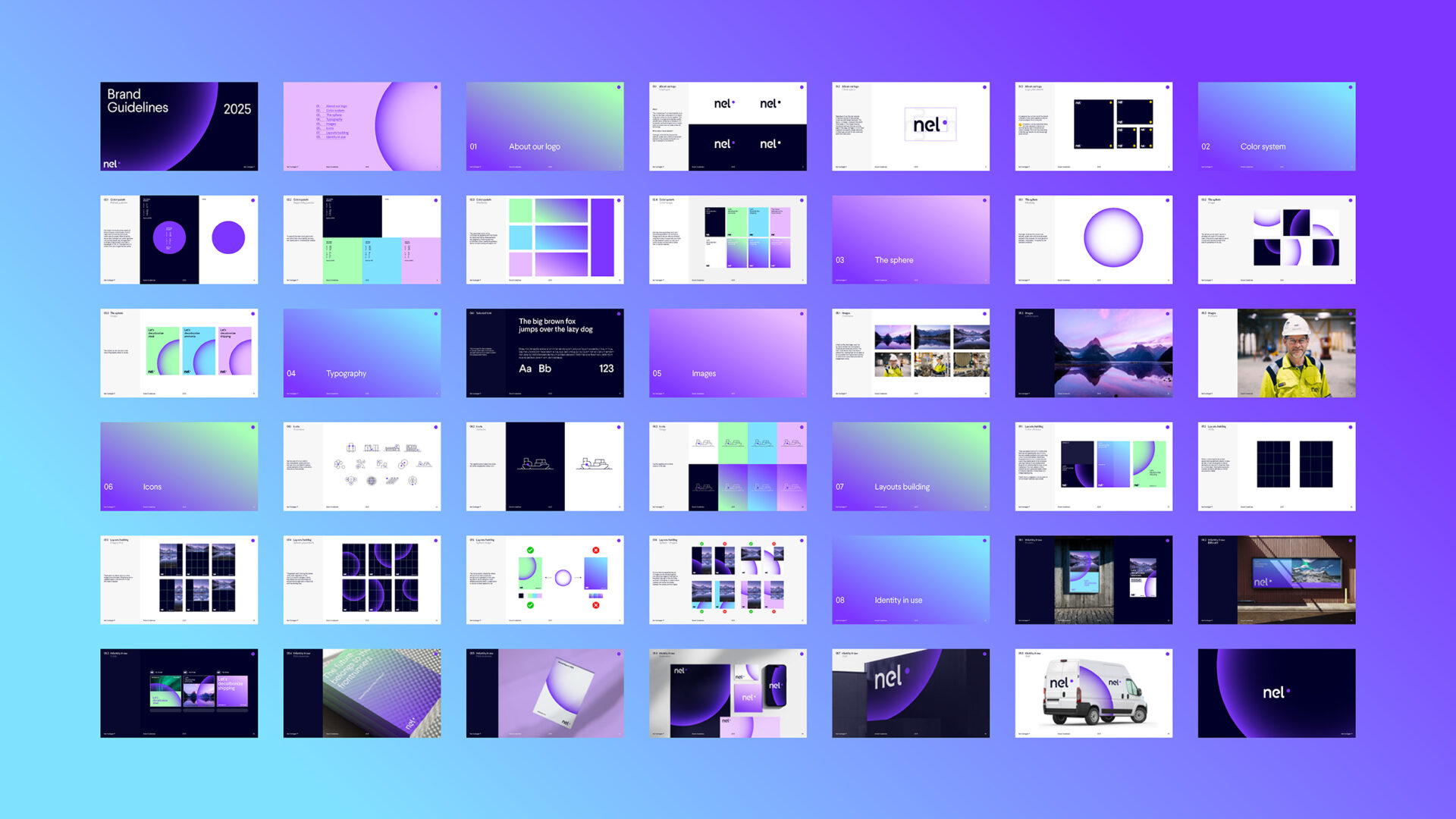
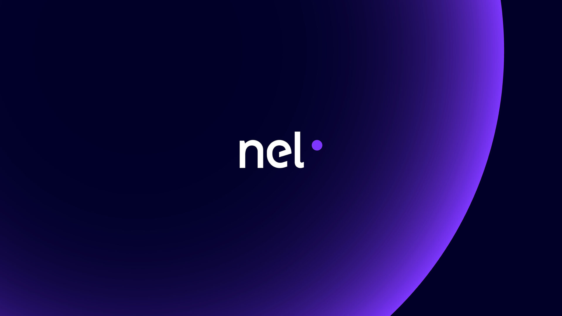
This refreshed identity for Nel Hydrogen builds on existing brand elements and pushes them toward a more contemporary and expressive direction. Brighter, more saturated colours give it energy and visibility, and the central sphere gains depth and lightness.

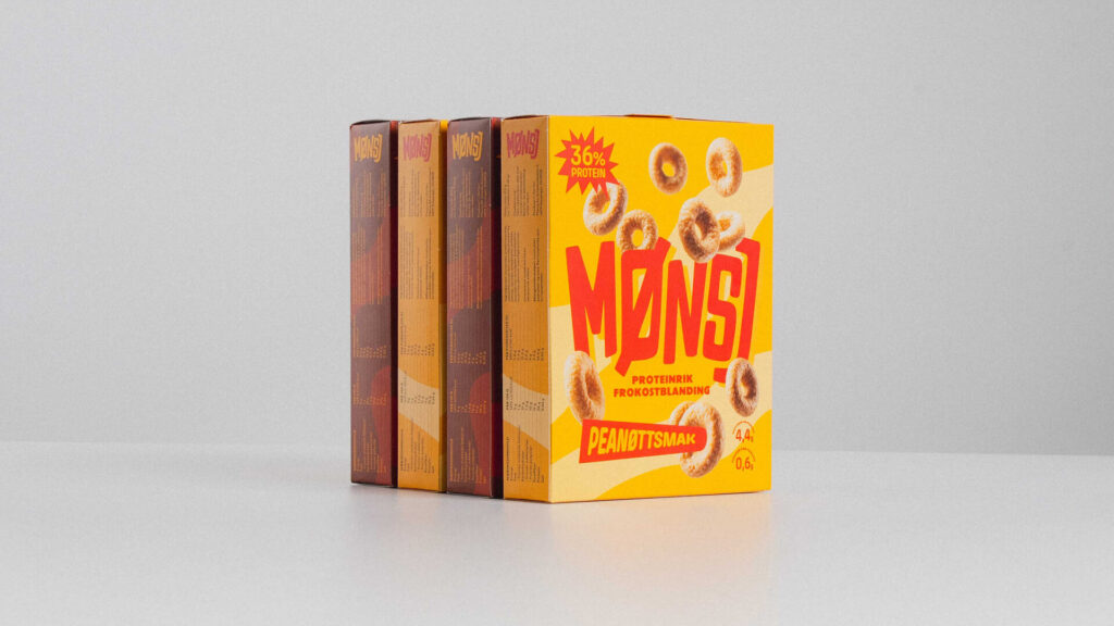
  • MØNSJ – Vintage punk rock on a cereal box

    Illustration, Packaging, Visual Identity
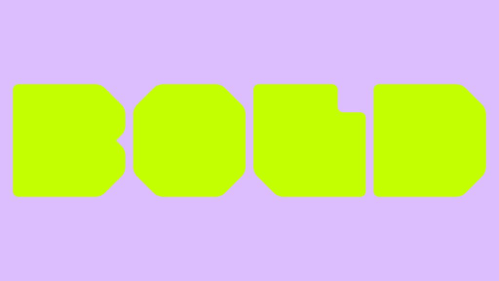
  • BoldType – A name taken literally

    Visual Identity
  • Otechos – From a logo to a system

    Visual Identity
  • NOVA Group – One horizon for many companies

    Motion design, Visual Identity