What we do
We see every project as a journey.
Our job is to make sure you set out with the right tools to reach wherever you want to go.
Brand Journeys
We define branding as the translation of an essence into a distinct visual character. Every brand sets out from a different point — some have nothing yet, some have too much, some need to signal that they have changed. So we don't sell one process: we build the path that fits the brand in front of us, from creation to expansion.
Let's chat about your brand 👉Brand Start
The context
The seed of an idea exists, but it lives only in someone’s head or in a spreadsheet. It has no face, no voice, no name. To succeed, a business concept has to be translated into something people can see and trust.
The journey
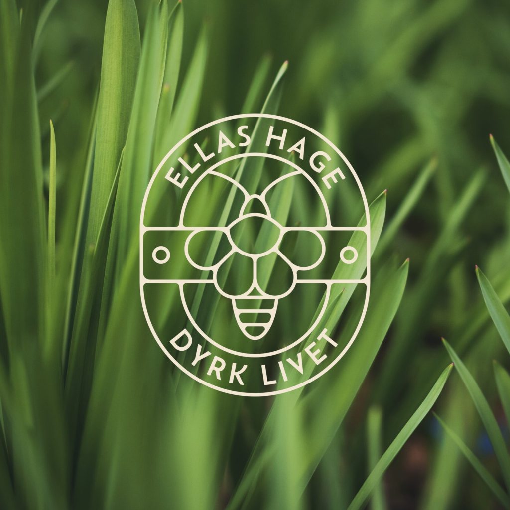
The invisible is made visible. This is the foundational path for defining an entity.
— Discovery — a deep dive to find the “why” of the business, so the brand is built on solid ground.
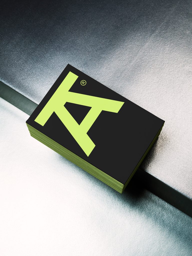
— Character building — developing a personality, not just a logo. Through illustration and design we create a visual voice that speaks to the audience before they have read a single word.
— The toolbox — building the essential assets needed to enter the market with confidence.
The result
From concept to entity. A clear identity system that lets the business launch not merely as a company, but as a brand with a story.
Brand Evolution
The context
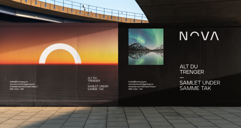
The brand is established, with history, customers and recognition in its market. Visually, though, it has fallen behind: it can look badly executed, inconsistent, or simply stuck in a decade that has passed. The goal is to look modern and competitive without losing the recognition already earned.
The journey
A restoration, not a demolition.
— The audit — identifying the core elements, the specific colours, shapes or quirks that create recognition, and protecting them.
— The refinement — the noise is removed. Technical errors are corrected, typography is refined, lines are cleaned up to optimise the expression for the digital age.
— The extension — a modern system is built around those core elements, with new tools that feel fresh and yet familiar.
The result
Renewed relevance. A brand that looks younger but feels entirely familiar, signalling innovation to the market without alienating loyal customers.
Brand Unification
The context
Two or more entities are becoming one. Different cultures, histories and visual assets are involved. The challenge is not to glue two logos together, which only creates confusion: a new shared identity has to honour the strengths of every party while signalling a common future.
The journey
Visual diplomacy, in search of the common thread.
— The audit — analysing the visual equity of all merging parties, to determine what is indispensable and what carries the most trust.
— The synthesis — experimenting with the balance. The colour of one can meet the typography of the other, or a new mark can be created that honours both. The process is iterated until the hierarchy feels fair and seamless.
— The system — developing a new set of rules for the new entity, so that internal teams share one single truth to work from.
The result
Cohesion. Internal and external misunderstandings are cleared up. One single, unified face that uses the inheritance of the past to build a stronger platform for the future.
Brand Expansion
The context
The core identity — logo and colours — is solid. But as the business grows into new channels, product lines or markets, the toolbox starts to feel empty. Improvisation takes over, because the specific visual assets needed to tell the whole story in these new spaces don’t exist yet.
The journey
The existing core is put to work to build a world around it.
— The gap analysis — identifying where the brand fails to communicate. Does it need a richer palette? An illustration style of its own?
— World building — the core elements are surrounded with new life. Secondary visual languages, iconography, patterns and sub-identities are created: they speak the same language as the parent brand, but widen its vocabulary.
— The integration — the new elements are woven into the existing guidelines, so that what is new feels as though it had always been there.
The result
Versatility. The move from a logo to a universe. The ability to communicate in complex environments without ever looking repetitive or inconsistent.
Brand Transformation
The context
The company is no longer what it once was. Whether the cause is a strategic shift, a new offer or a different audience, a gap has opened: the business reality is new, but the brand still tells the old story. A signal of change is required.
The journey
The outside is brought into line with the inside.
— The turning point — identifying exactly what has changed in the business strategy, and defining the new message the market needs to receive.
— The visual shift — old rules are broken. New colours, typefaces and image styles are explored to make sure the market notices the difference.
— The signal — designing the visual elements that stop the scroll and force the recognition: something is different here.
The result
Strategic alignment. Confusion in the market is eliminated. The brand becomes a precise reflection of the new reality, ready to take new opportunities with confidence.
Brand Motion
The context
The brand looks perfect on paper. The static elements are beautiful, but frozen in time. In a digital world where everything scrolls, swipes and plays, the identity feels stiff. It is missing the fourth dimension of brand building: time.
The journey
The brand is given a nervous system.
— The physics — defining how the brand behaves. Is it heavy and solid? Light and bouncy? Fast and energetic? The physical laws of the visual universe are established.
— The choreography — static elements are brought to life. Logo animations, transitions and screen graphics are designed so that every movement tells the same story as the design.
— The library — delivering a movement toolkit — intros, outros and templates — that makes the content instantly recognisable.
The result
A living identity. The brand wakes up, captures attention faster, explains complex ideas simply, and feels native to the digital surfaces where its customers actually are.


Packaging Journeys
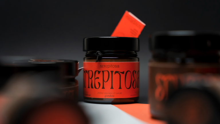
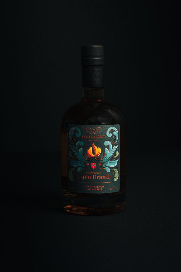
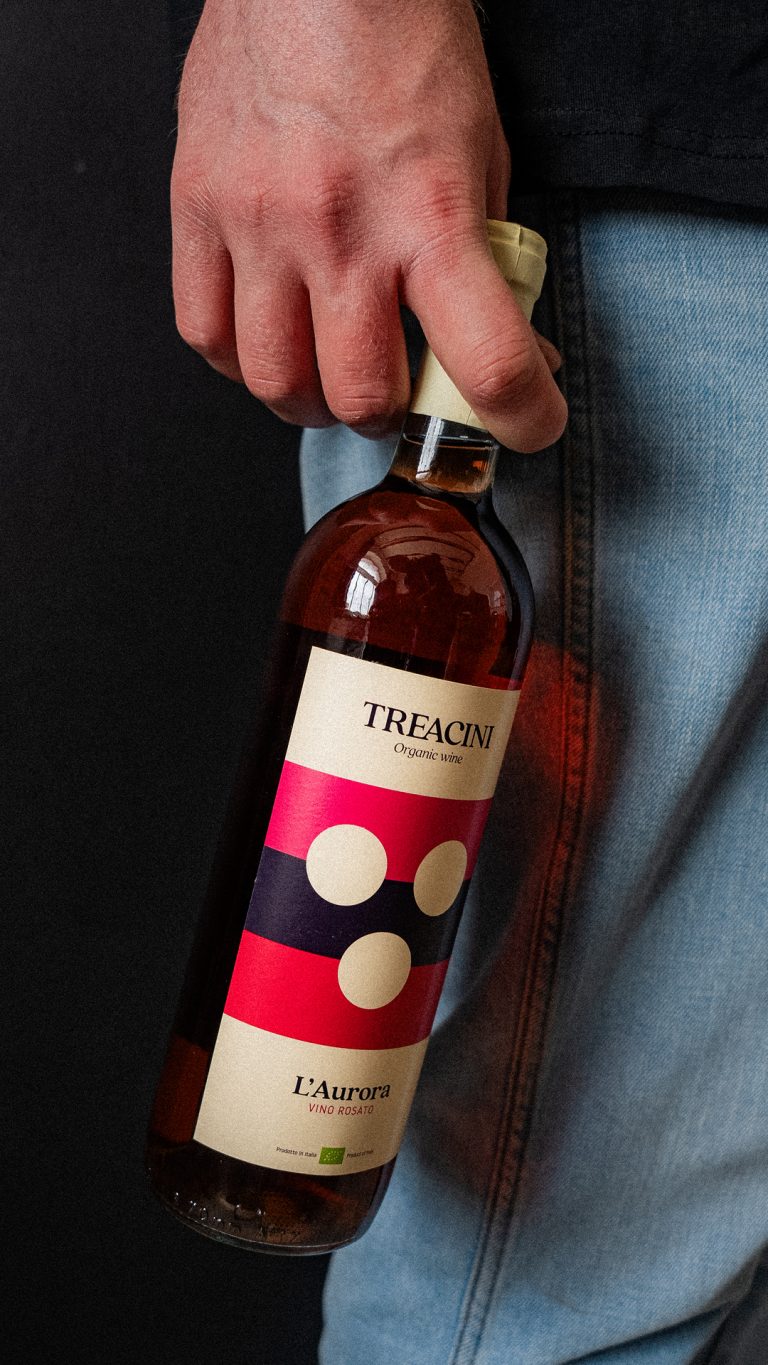
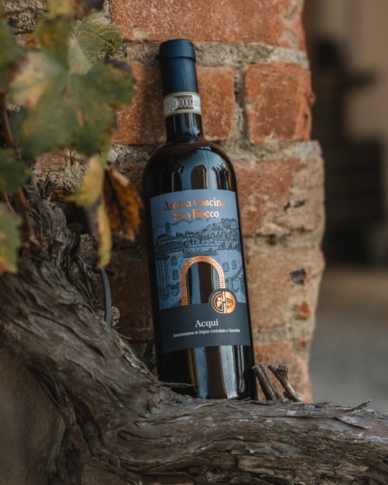
We treat packaging as the direct expression of a product's essence, making sure the outside is a truthful reflection of the inside. Our goal is to empower the product — to move past decoration and design something that reveals and enhances the character of what's inside. On a shelf, the pack is not the brand's messenger. It is the brand.
Let's talk packaging 👉Packaging & Identity
The context
A product has to launch on a tight budget or a start-up timeline. There are no resources for a long corporate branding phase; the priority is selling. The product is the brand.
The journey
The traditional process is turned on its head, for efficiency.
— Product-first design — instead of producing a theoretical brand manual, the identity is built directly on the physical packaging. Logo, typography and palette are designed on the box, the bottle or the can.
— Extraction — once the packaging is approved, the elements are pulled out to form the essential brand kit.
— Launch-ready — focus stays exclusively on what it takes to get onto the shelf.
The result
Efficiency and impact. A market-ready product and a functional visual identity, delivered in one single streamlined process.
New Packaging
The context
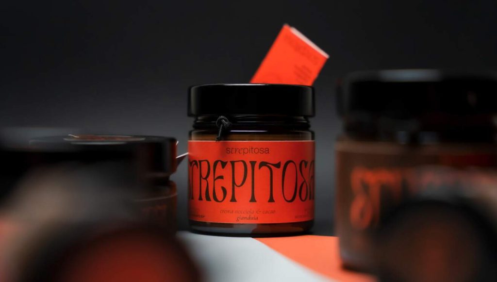
The brand is established, but a standalone new product has to launch and it has to shine. The challenge is to create something that feels new and exciting without looking as if it belonged to another company.
The journey
Everything focuses on the moment on the shelf.
— Spotlight — analysing the competition in this specific category.
— The livery — designing a label or pack that respects the parent company’s DNA while giving this particular product enough personality to be seen among its competitors.
— The details — handling the tactile decisions — materials, finishes, die-cuts — that make the product feel valuable in the hand.
The result
A clear launch. A distinct product that belongs to the family, but is strong enough to build a following of its own.
Packaging Restyling
The context
The product sells, but the packaging looks dated, tired, or is losing ground to newer and sharper competitors. The appearance needs a lift to grow sales — while confusing existing, loyal customers has to be avoided.
The journey
Correcting faults, not changing for the sake of change.
— The recognition check — identifying the key triggers customers look for: colour, shape, layout.
— The clean-up — legibility improves, typography is updated, hierarchy is refined. Clutter is removed so the product reads once again as premium and trustworthy.
— The refinement — the design is optimised for modern shelf presence, physical and digital alike.
The result
Renewed authority. The same recognisable product, only cleaner, sharper and worth more in the eye of the buyer.
Packaging System
The context
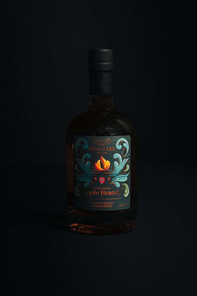
A range already exists — different flavours, scents or variants. Right now they can look untidy on the shelf, or customers struggle to tell them apart. Design alone is not enough here; this needs logic.
The journey
The move from designing a box to designing a grid.
— The architecture — building a visual framework that balances consistency (it all reads as one brand) with differentiation (the variants are easy to tell apart).
— The rules — developing strict guidelines for typography, colour coding and the placement of illustration.
— The block — testing how the products look stacked together, to make sure they dominate the shelf.
The result
Order and impact. A coherent product family that customers can navigate easily, which encourages buying across the range.
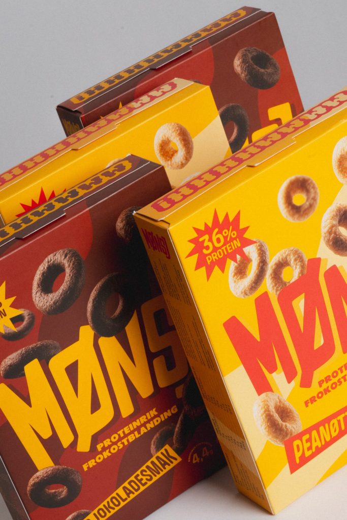
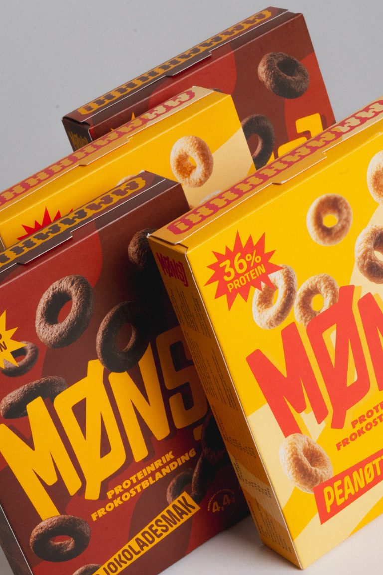
Packaging Extension
The context
A working packaging system is already in place, and the family is growing. A new line has to join the range. It needs to look fresh, but it has to follow the existing rules to the letter.
The journey
Seamless integration.
— The analysis — studying the existing grid to find the free slot: a colour or an illustration style not yet in use.
— The application — the new content, a new flavour or a new name, is applied to the existing architecture.
— The balance — making sure the new product feels distinct enough to register as new, and identical enough to register as part of the brand.
The result
Seamless growth. The new product looks as though it had always belonged on that shelf, and strengthens the presence of the whole family.


Other Journeys
Aptum Studio is a branding and packaging studio. But no identity is built out of shapes alone: it is written in graphics, illustration, photography and motion. These are the visual codes we work in every day, inside a Brand or a Packaging Journey — and they can be commissioned on their own, when what you need is one strong image rather than an entire system.
Let's talk about what you need 👉Art Direction
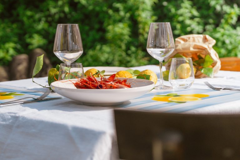
Ideas and execution for a campaign: what it should say, what it should look like, and how it holds together across every format it has to appear in. We take it from the first concept to the finished visual, and we can build the team around it when a project needs photography, film or illustration in the same breath.
Illustration
Illustration spices up the communication. It gives a brand a trait nobody else can own — sometimes eccentric and bold, sometimes pedagogical and precise. It is where function meets pure expression. It takes different forms depending on what it has to carry. Sometimes it is an entire illustrated language for a brand or an event, consistent enough to be extended for years. Sometimes it is artwork drawn for a single product, made to fit the pack it lives on. Sometimes it is the main visual that anchors a campaign, an infographic that finally makes something complicated clear, or a mascot that becomes the face people recognise before they read the name.
Photography
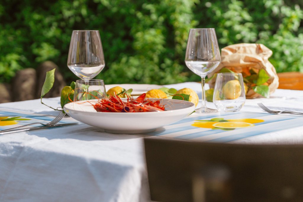
Images made for a specific brand instead of chosen from a library: products on set, places as they actually look, people who work there. Photography is one of the codes we use to build identities, which means it is shot inside the visual system, not next to it.
Video Production
Some things a still image cannot do. Film carries duration, sound and sequence, and it is often where a brand becomes credible rather than merely attractive — a product in use, a place with weather in it, a person talking.
Motion Design
Movement, animation and screen graphics for content designed to live on digital surfaces. Where Brand Motion defines how an identity behaves as a rule, motion design applies it: the specific piece, campaign or format that has to move.