👈🏻 back to all

Client:

BoldType

More information

Title:

A name taken literally

Journey:
Brand Start
Service:
Visual Identity
Industry:
Consulting
Location:
Norway

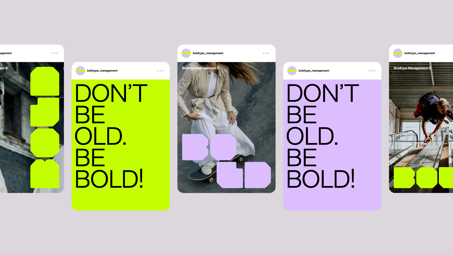
BoldType is a consultancy founded by a group of young entrepreneurs, working with events and audiences that speak fast. They needed an identity that said who they were before anyone asked. The name was already the brief: bold, young, solid. We took it literally.

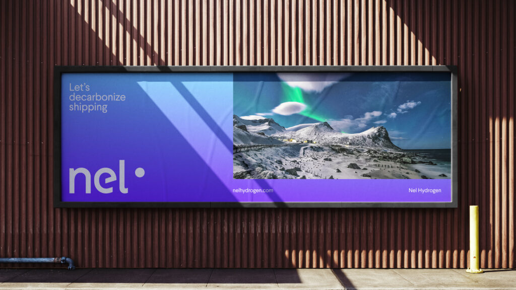
  • Nel Hydrogen – Brighter colour, more depth

    Motion design, Visual Identity
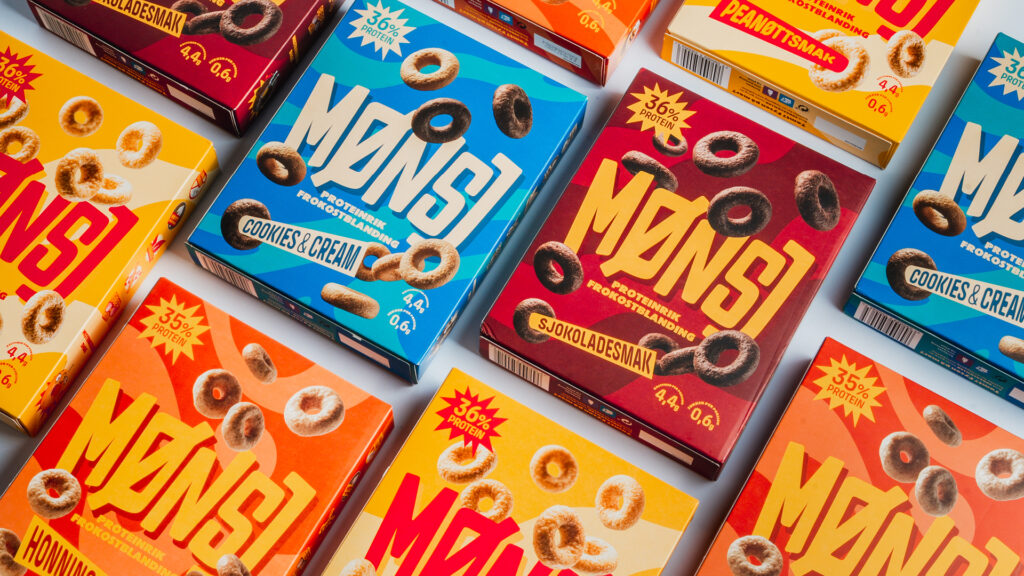
  • MØNSJ – Vintage punk rock on a cereal box

    Illustration, Packaging, Visual Identity
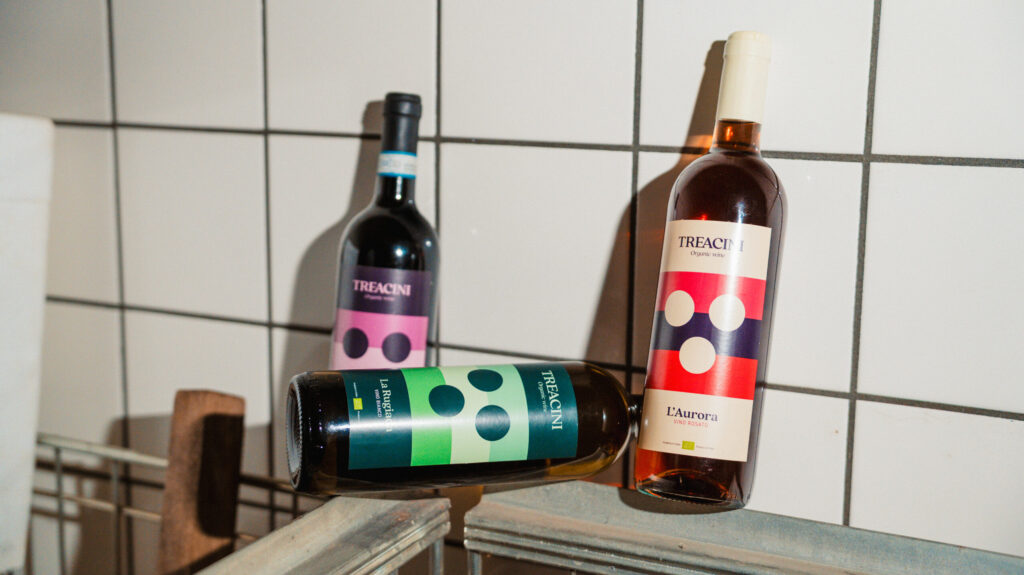
  • Tre Acini – Simplicity in the product, simplicity on the label

    Packaging, Visual Identity
  • NOVA Group – One horizon for many companies

    Motion design, Visual Identity